Wednesday, February 3, 2010

Bibliography

Sutton, J. (2005) Platonic & Archimedean Solids, Glastonbury: Wooden Books Ltd.

Wade, D. (2006) Symmetry - The Ordering Principle, Glastonbury: Wooden Books Ltd.

Bernard, C. (1979) Graphs and Networks, Oxford: Oxford University Press

Brook, G.L. (1980) Books and Book Collecting, London: Andre Deutsch Limited

Mandelbrot, B. (1977) The Fractal Geometry of Nature, New York: W.H. Freeman and Company

Lesmoir-Gordon, N., Rood, W., Edney, R. (2000) Introducing Fractal Geometry, Cambridge: Totem Books

Greenberg, I. (2007) Processing: Creative Coding and Computational Art, New York: Springer-Verlag

Rossini, F.D. (1955) Thermodynamics and Physics of Matter, Oxford: Oxford University Press

Monday, February 1, 2010

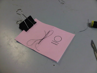
Making final book

From InDesign sessions I've gained an understanding of how to use the software, so overall the process went pretty well in terms of the editing and printing. Once I'd made sure each object was centered on Illustrator, I was able to save them as PDFs and they seemed to line up pretty much perfect...

After wasting a substantial amount of the earth's resources I got a little help with printing and the inside of the booklet all went pretty much to plan. As for the covers, printing on colour was relatively simple, I just had to change one of the settings to Paper Feed in the printing options, so it only accepted paper from a particular tray. I cut and bound the books myself with a little direction from a friend, the first one or two weren't great but I got a lot better with the fiddley bits with practice. This was a really satisfying process for me as I've been crippled by fear every time I've been down in Vernon Street doing any sort of binding, and this was the first time I've got to the stage where I'm genuinely comfortable with putting a book together.


Book Cover Fonts

These are some of the fonts I've been playing with for my front cover; Myriad Pro, Times, Baskerville Old Face, Century Schoolbook (all in italic) and Helvetica Neue...


I'm swaying towards an Italic Serif face for sure, I feel like it communicates the nostalgic school jotter vibe I'm going for. I'm going to make it in a few different colours if I have the time.

Friday, January 29, 2010

Exhibition


I'm struggling to think how this could've gone worse, the whole point of this exhibition for me was to gain an experience of the audience reaction to my piece. In the build up to the exhibition I had a lot of help putting my work up and building a little corridor for it, and all the reactions I got to how the work looked visually were very positive. The problem was I felt it didn't communicate the concepts of my research independently, not without the book, and it was clear that few people new what the piece was about. So I set about putting together a short and to the point piece of writing to have on the wall next to it, in order to fill in the blanks that hopefully my book should create an understanding of. However before that was finished the perspex dropped (for the second time, although this time unfortunately not on my foot) on the floor and a huge chunk was taken out of it. About an hour before the exhibition started an already dodgy light connection stopped working altogether, so rather than being a light box, it was just a box with a whole in the front. Ouch. Christian suggested that I put a lamp or torch through the whole in the front to light up the inside, which to me just seemed like a huge compromise after all the effort I put in. So sadly it came down to covering my work up.


In terms of putting together the exhibition my only responsibility was helping with the postcards, I actually was pretty unsure about the way they were displayed considering I assumed it was intended to be postcard format not just postcard size. I guess it was the quickest and easiest way of doing it and it worked quite well in its collected randomness.

Thursday, January 28, 2010

Book Pages

I want the content of my book to reflect the concepts I've been looking at, in particular the idea of self-similarity and being able to 'see' the forms that self-similarity takes. The idea is that through the plethora of numbers and equations, non-mathematicians like myself and I imagine most people who will see my book, simple artistic forms can help us understand what all the science and maths means. I chose to use a book called 'Thermodynamics and Physics of Matter', edited by F.D. Rossini, as the background, the actual text on the pages is of no particular importance but more, the presence of that book within my book is important. First of all it is a first edition, and therefore valuable as a collectors item, I found it while hunting through books in Oxfam. Second of all it covers an incredibly lucid subject, the concepts of matter, turbulence etc. are not strictly visible to us without some form of simple geometric diagram to help aide not only someone who has no understanding of the subject but also an aspiring physicists' understanding. Lastly, most pages are covered in long lists of equations, some that I've tried to get my head round but my brain clearly doesn't think that way. Basically out of a number of days looking through charity shops and little independent book stores this seemed the most appropriate to use as it covers so many of the concepts I've been looking at.


In relation to this I wanted to use my understanding of the most simple, regular polygons as a visual element, with regards to Mandelbrot's concept of invariance (see post on fractals). I've been working with Illustrator using simple mathematics to make sure my shapes were completely centered before repeatedly duplicating and resizing them, I chose squares, triangles and pentagons as they are the only shapes that fit together filling the plane completely, and form the unified platonic solids.


So this should hopefully come together easy enough in InDesign, and I'm also hoping that it reflects my ideas successfully. In order to kind of increase the success of the communication of my concepts I thought it would be a good idea to put a quote in the beginning that would gain an initial engagement of my audiences understanding of the ideas in my work.

Wednesday, January 27, 2010

Postcard

So I've got my postcard ready for the exhibition, I've decided to make it as postcard-like as possible. Unfortunately downstairs in digital print room, one side gloss and the other side matt wasn't available, so I had to go for matt on both sides on some thick card. Because my book won't be ready for the exhibition, I wanted an obvious visual connection with my light box piece, so I chose to work with block colours - something I had to work with because of my chosen medium of vinyl. I also attempted to have a level of continuity of self similarity with the influence of theorists Koch and Sierpinski...


I'm not sure how they're going to be displayed so I made it double sided, hopefully it won't just be stuck to a wall.


Tuesday, January 26, 2010

Vinyl For Light Box

After asking around the most recommended vinyl store in Leeds seemed to be Sidney Beaumont, a massive warehouse with an array of choices and an interesting spaceship wall-piece displaying the words "The vinyl frontier". The guy that worked there was really helpful and it was pretty cheap, I picked up a catalogue of translucent vinyl so you can see the sort of colour range they had..


The actual creation of the piece posed a similar task in terms of me having to engage with number problems when putting the visuals together, I attempted some mock-ups using the colours of vinyl I thought I would use. Even successfully doing this forced me to consider the specific sizes and angles needed, rather than just doing it by hand/mouse/trackpad and hoping for the best.


The problem is these just seemed to rigid, almost too sign-like, this would always be a risk when creating something dealing with precise measurements or dealing with simple mathematics. I think the choice to work with s semi-regular pattern worked quite well visually, reflected the idea self-repetition and simple mathematics, perhaps not incredibly obviously to someone who has no idea what my work is about. So hopefully I can have my book finished by the exhibition so that people can see/connect the too and understand the concept of my work. Here is some evidence of me making it and stuff...


Monday, January 25, 2010

Limn Logo

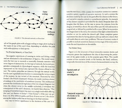
Inspired by some of the imagery from 'Graphs and Networks', and more so some visuals representing narrative from 'Narrative as a Virtual Reality' by Marie-Laure Ryan (a book I looked at it in Comm. Tech.)....


The idea was to have a simple hand drawn depiction of the idea of networking, we liked the idea that as well as a party and live exhibition, it would be a great platform for creative minds to meet and network. We wanted to keep with the simple hand drawn theme, so we thought it would be a good idea to keep the spontaneity that our initial type communicates, this was merely to 'enframe' the type and make it more logo-like. We drew on a number of surfaces, and played with the different shapes a little before deciding on one.


Our work kind of spills out onto this blog as well while the site is still being developed

Lightbox

So I've attempted to document the making of my light boxes, I joined a group session for making light boxes wherein I put together a small A4 sized box, mainly for practice and just to get a feel for the different machines down in Woodwork. It came together pretty easily and meant I had a chance to talk to Roger about what was possible.


Out of preference I chose some dark plywood to work with rather than MDF, although the MDF was cheaper, I didn't want the box to be painted and the plywood looked so much nicer. I chose a hexagon, going with the regular polygon theme - the relevance being that it is made up of six equilateral triangles. The process wasn't that difficult, especially with the level of help, in proof of the use of lots of numbers and maths, heres some scans of my notes from the couple of days I was in woodwork...


So this is what the light box looks like, pre-perspex and artwork...


Polyhedra Creation Software

Experimenting with some applets and online programs for polyhedra creation...


This was some software called Hyperstar, both programs functioned in a similar manner, using scrollbars to input numerical data and create forms...


I struggled to see the purpose of these in terms of their use, it's unlikely anyone would understand what way the numbers were input to cause these forms as an output. It's likely it would just be a case of someone moving the scrollbars up and down and looking at the nice shapes - I guess that's not a bad thing.

Sunday, January 24, 2010

Processing pt. 2 - my first algorithm


Some more Processing experiments, working with literals and variables (coding stuff) I created a stepped radial gradient using a simple algorithm. I've started to get to grips with a lot of the coding language, like actually learning what it all means and not copying and pasting. I messed with some of the dimensions to create slight irregularity. Again doesn't look like much but I've learnt a lot from doing it.